


As they prepared for their next stage of growth, the team sought to evolve their minimal brand identity into a system that better reflected both their current capabilities and their long-term vision. The branding initiative encompassed a complete visual identity suite, stationery, apparel, patterns, email templates, and comprehensive brand guidelines designed to scale with the company.
The original logo—created by the founder—served as a meaningful part of Daxo’s early story, but the brand needed refinement to resonate with a wider audience. After in-depth conversations with the leadership team and an extensive competitive analysis spanning small orchards to sophisticated commercial farming operations, I presented an initial round of concepts centered on updated logomark-driven identities paired with clean, modern wordmarks.
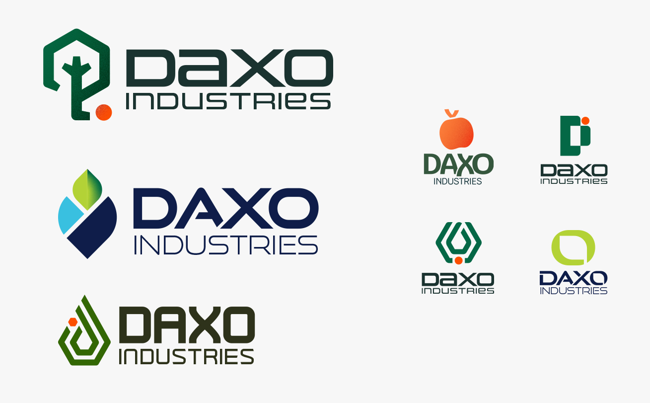
While the team appreciated the direction, they requested a more streamlined execution and expressed a strong desire to retain the visual familiarity of the original wordmark by incorporating the mark directly into the name. Hexagonal forms stood out as a favorite among stakeholders, symbolizing structure, efficiency, and innovation.
Through collaborative refinement, a simplified hexagonal mark integrated into the wordmark emerged as the final logo—striking a balance between technological sophistication and agricultural authenticity.

With the logo approved, the system was expanded across stationery and apparel, including business cards, letterhead, notebooks, hats, water bottles, t-shirts, and button-downs.
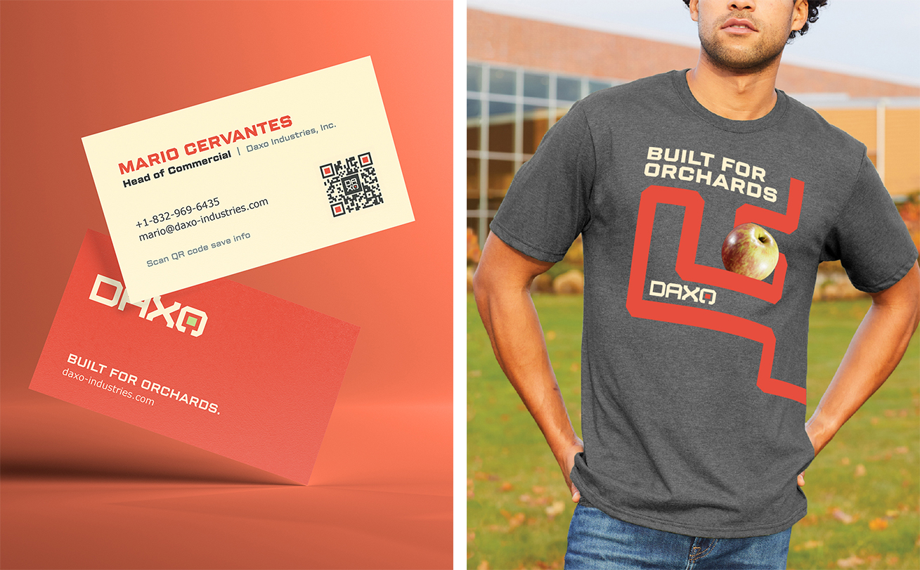

These pieces were selected intentionally: informed by audience research and industry experience, the apparel and gear reflected items growers, packers, and field teams would actually use—ensuring the brand felt grounded, practical, and credible in real agricultural settings.
To support the startup’s lean internal team, I also developed a suite of modular email templates built directly in Klaviyo. Designed with more than 50 interchangeable content blocks, these templates empowered the team to independently create and send on-brand campaigns with ease. Built mobile-first—critical given that growers and supply-chain partners are often in orchards or packing facilities rather than at desks—the templates contributed to a measurable increase in communication efficiency, including a 22% boost in engagement and follow-up from cold outbound sales efforts.

Comprehensive brand guidelines were created to equip Daxo with the tools needed to manage its growing identity system. The visual direction blends clean, tech-forward elements with warm, earthy tones that speak to the agricultural world. Because produce growers respond most to clarity and authenticity, the photography style features a mix of candid orchard imagery, real moments from the apple supply chain, detailed macro shots of fruit, and product-focused visuals. A custom pattern—referencing both packhouse production lines and microchip circuitry—bridges the gap between agriculture and innovation, rounding out a brand that feels equal parts grounded and forward-looking.